Pieces Brand
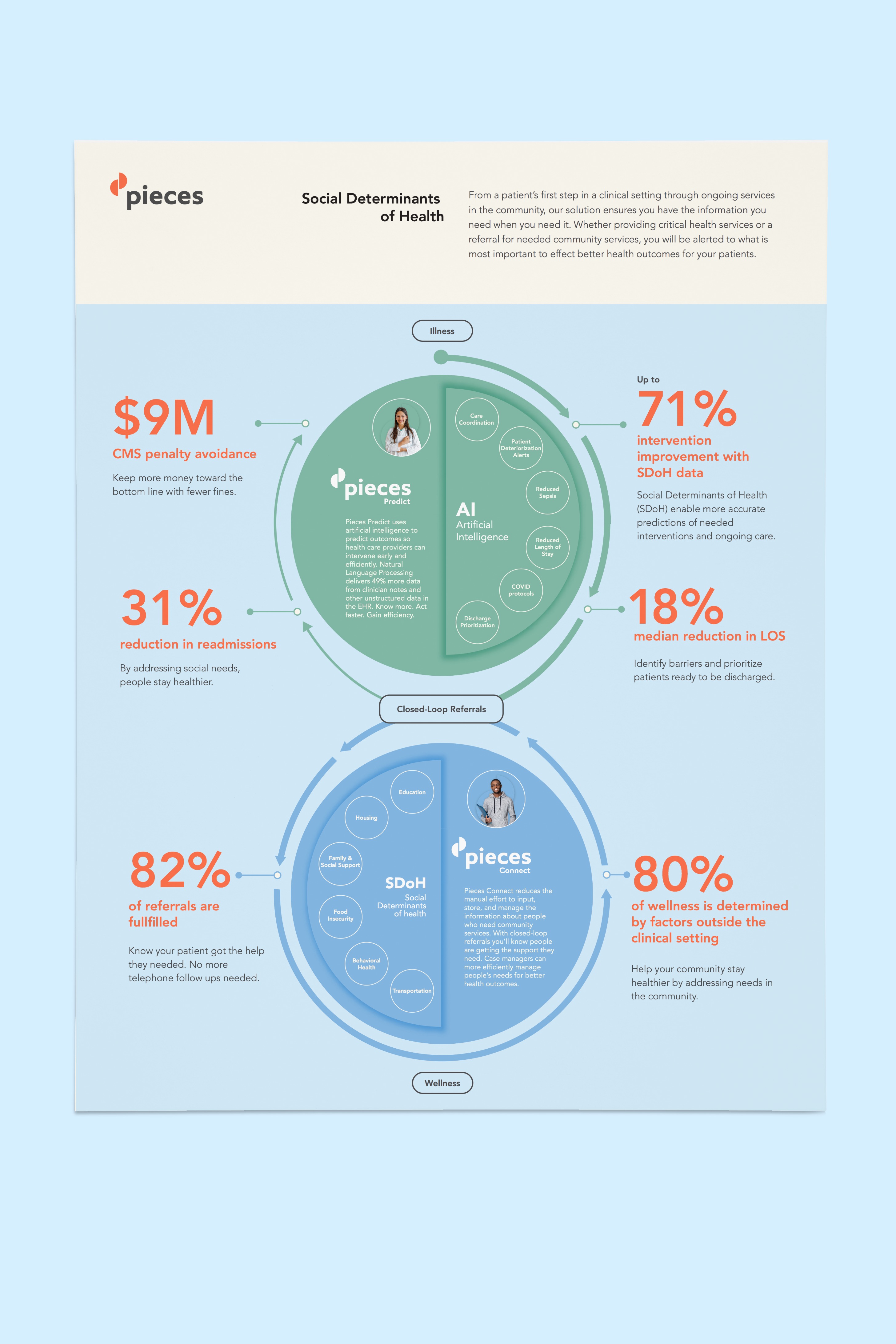
Pieces is a technology company that applies the latest in artificial intelligence to help hospitals, hospital systems, and community organizations work more efficiently to have better patient outcomes and a stronger bottom line.
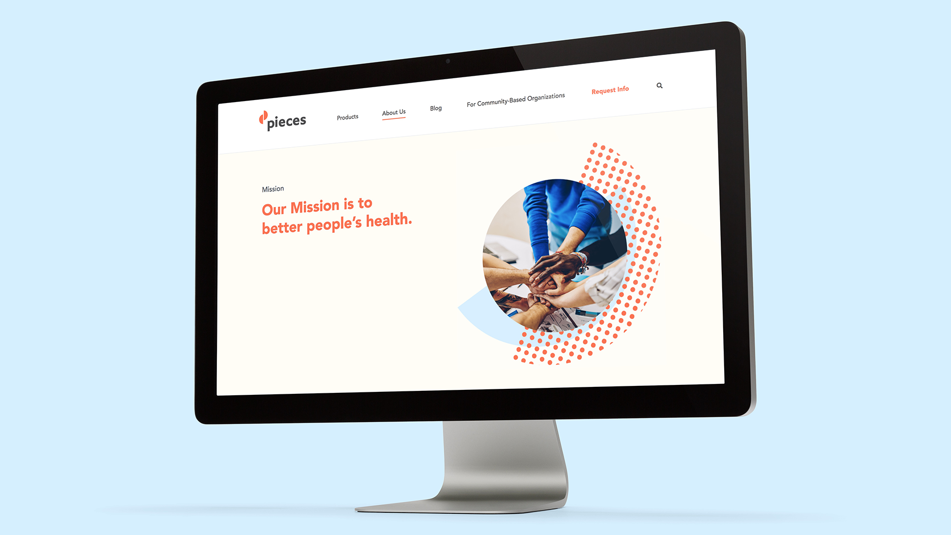
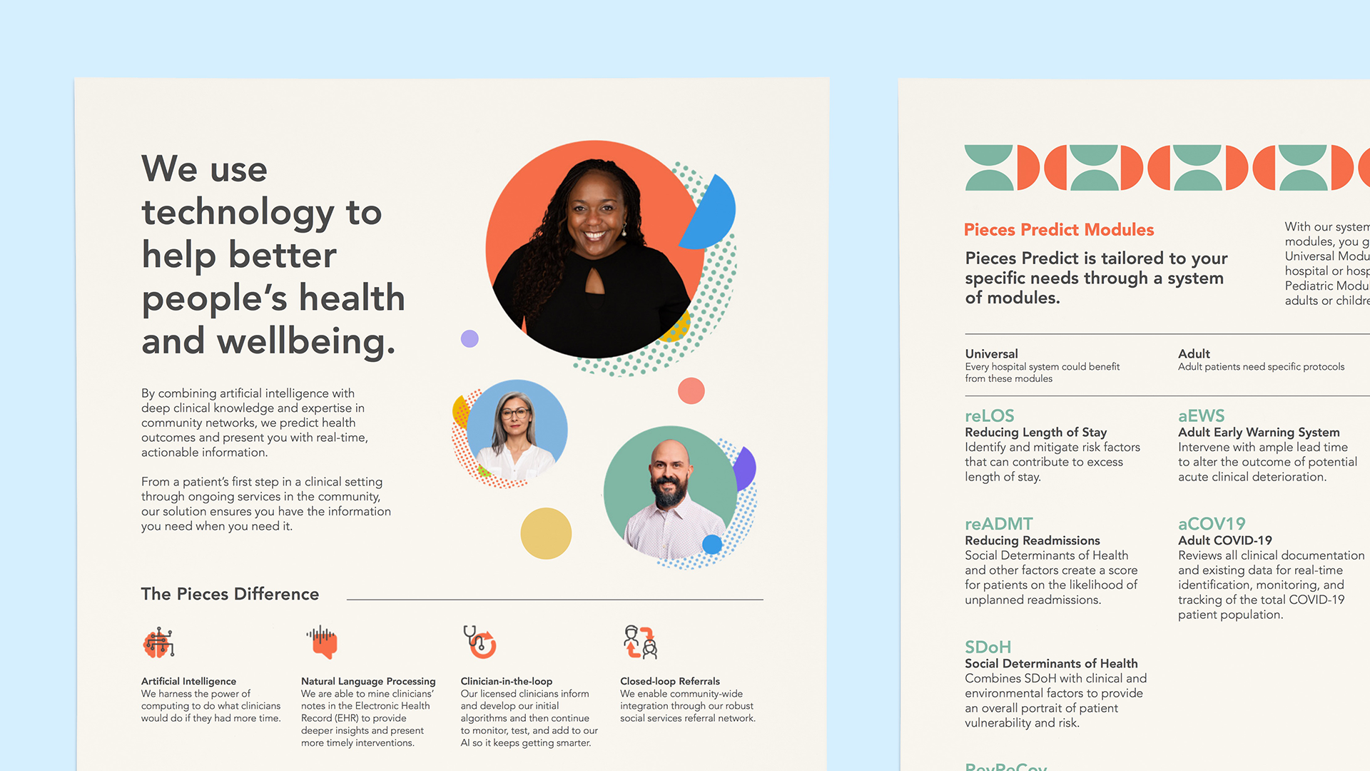
The complexity and depth of their products paired with multiple target audiences was making messaging difficult. They needed to clearly differentiate their product offerings and evolve their brand to reflect their mission to better people’s health and wellbeing.
My Role: Art Director | Designer
Agency: BrowneMusser

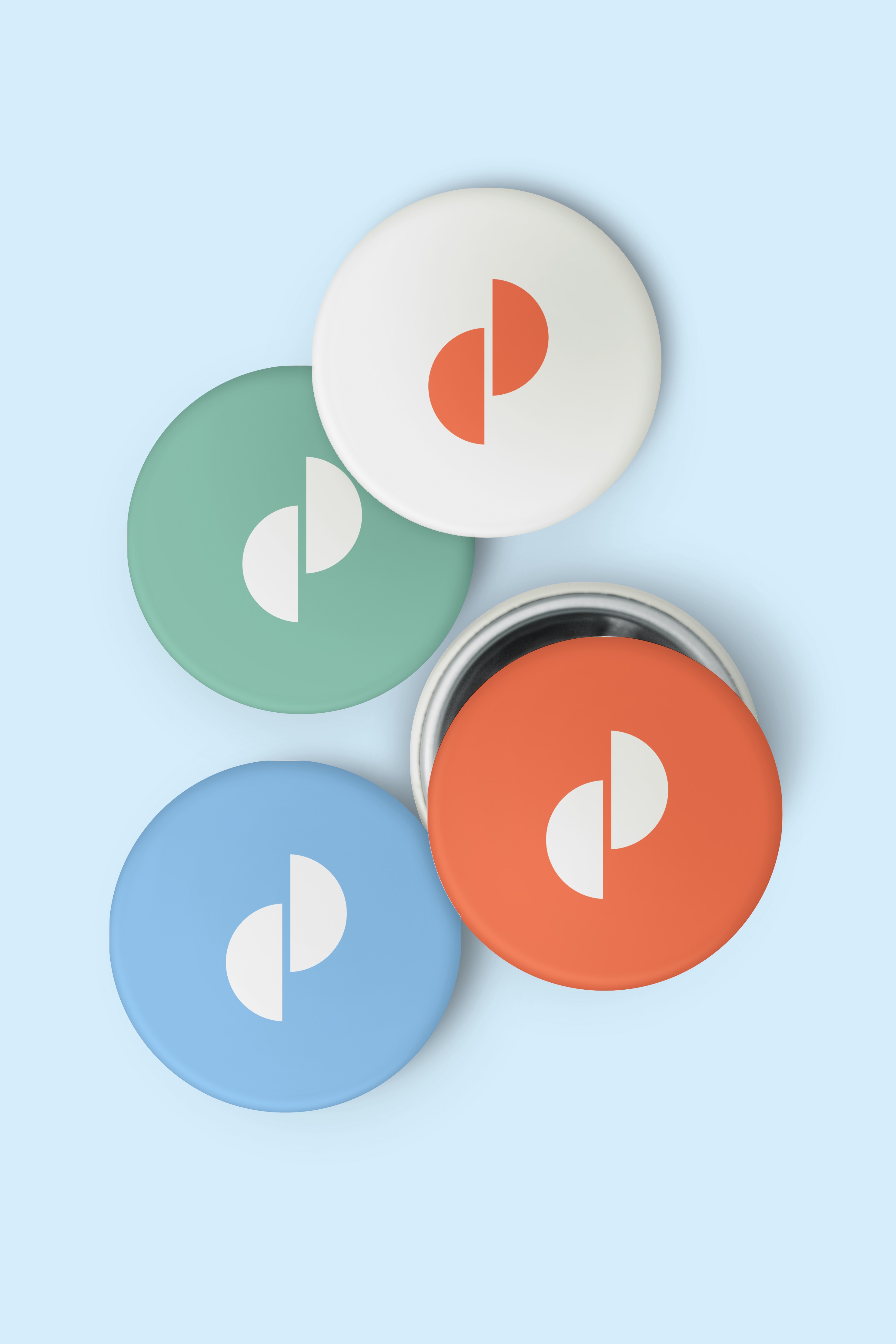
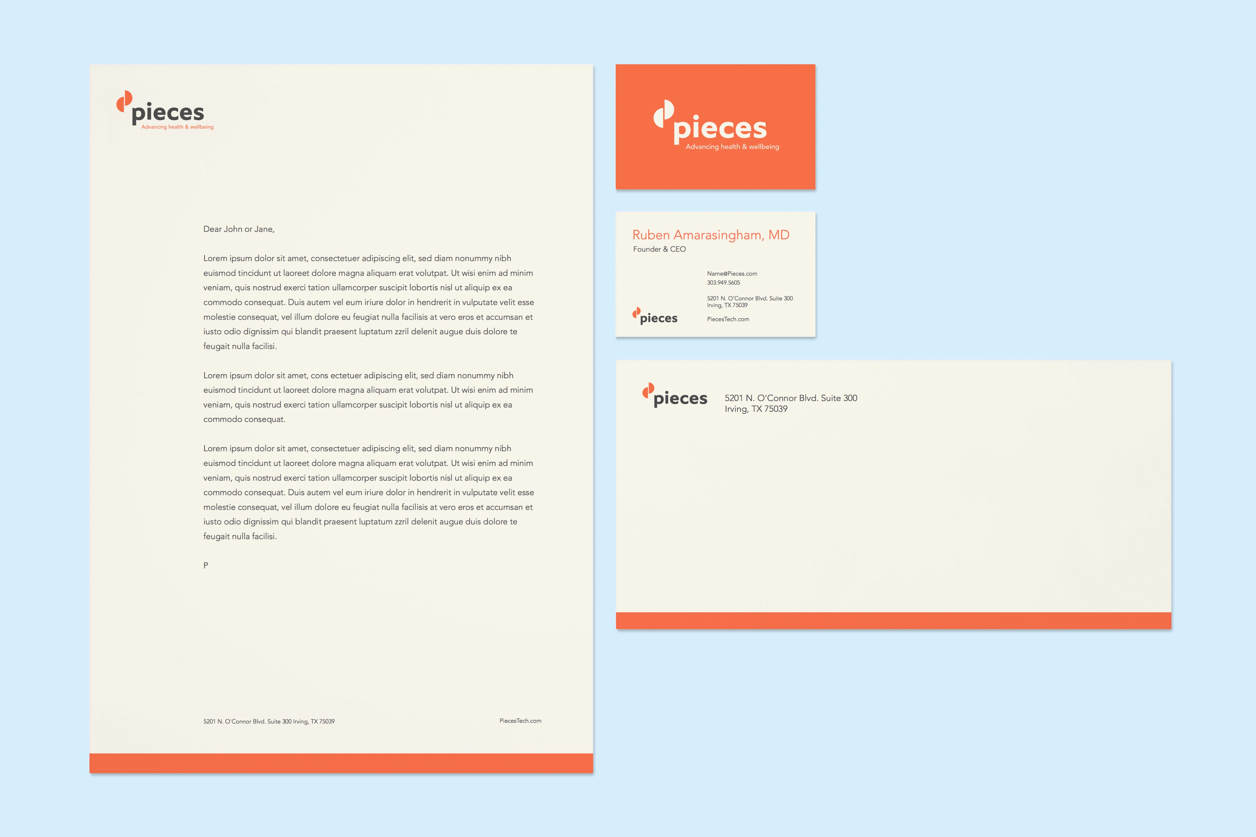
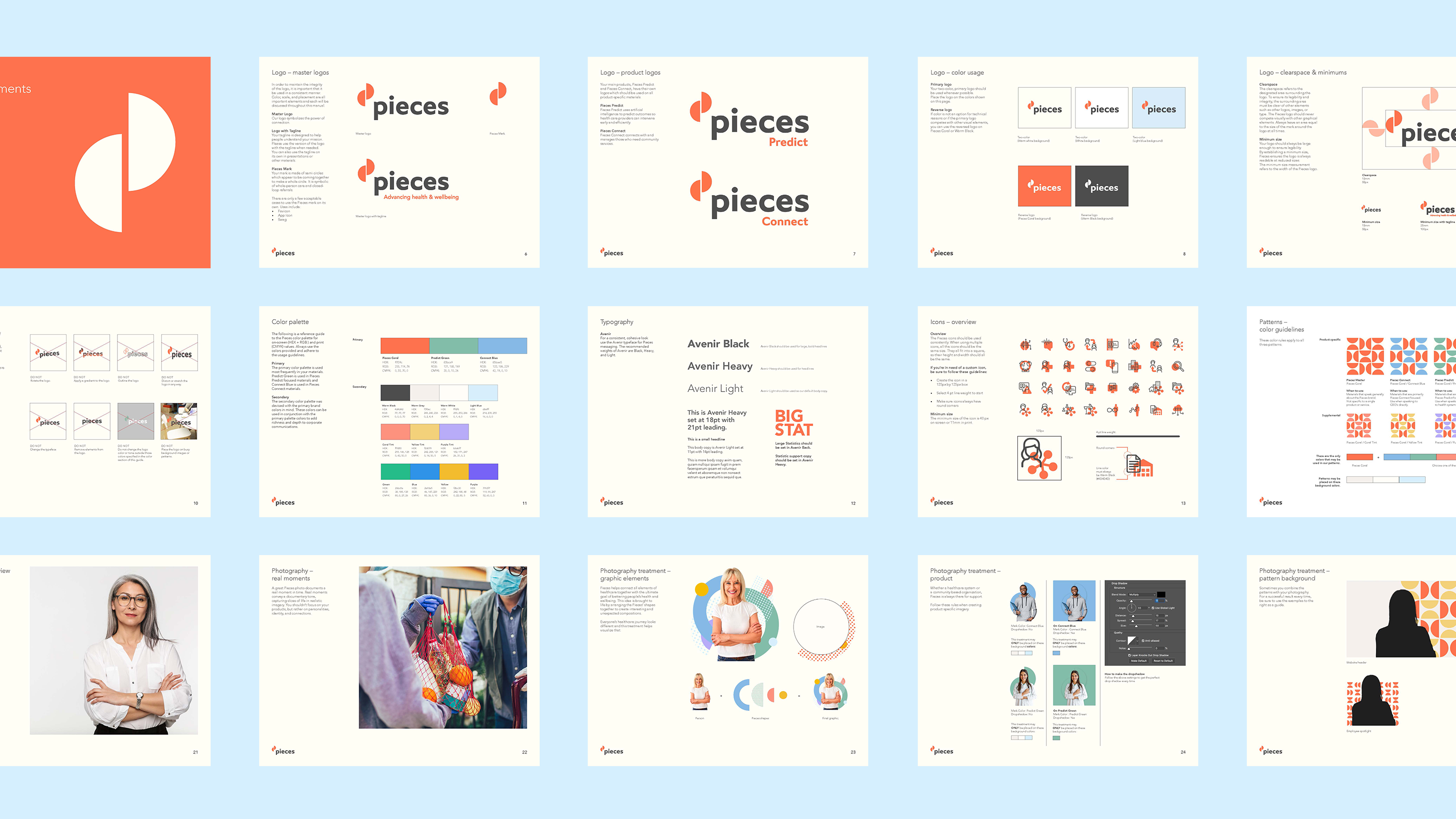
The Pieces logo mark is an abstract representation of the letter P. The two semi-circles appear to be sliding together, moments away from creating a whole. This idea, at the core, is fundamental to what Pieces technology does. It helps bring clinical and social aspects of a patient's healthcare journey together to better inform clinician's decisions to ultimately improve patient outcomes.
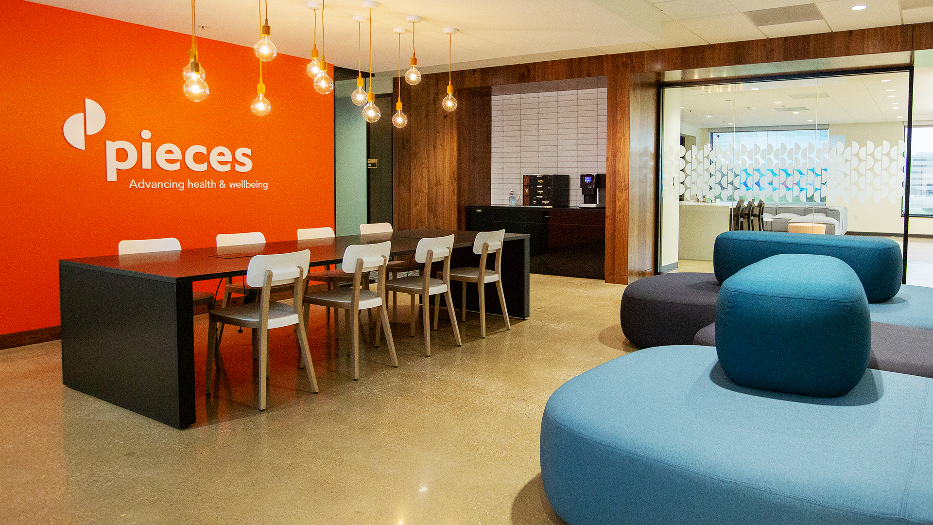
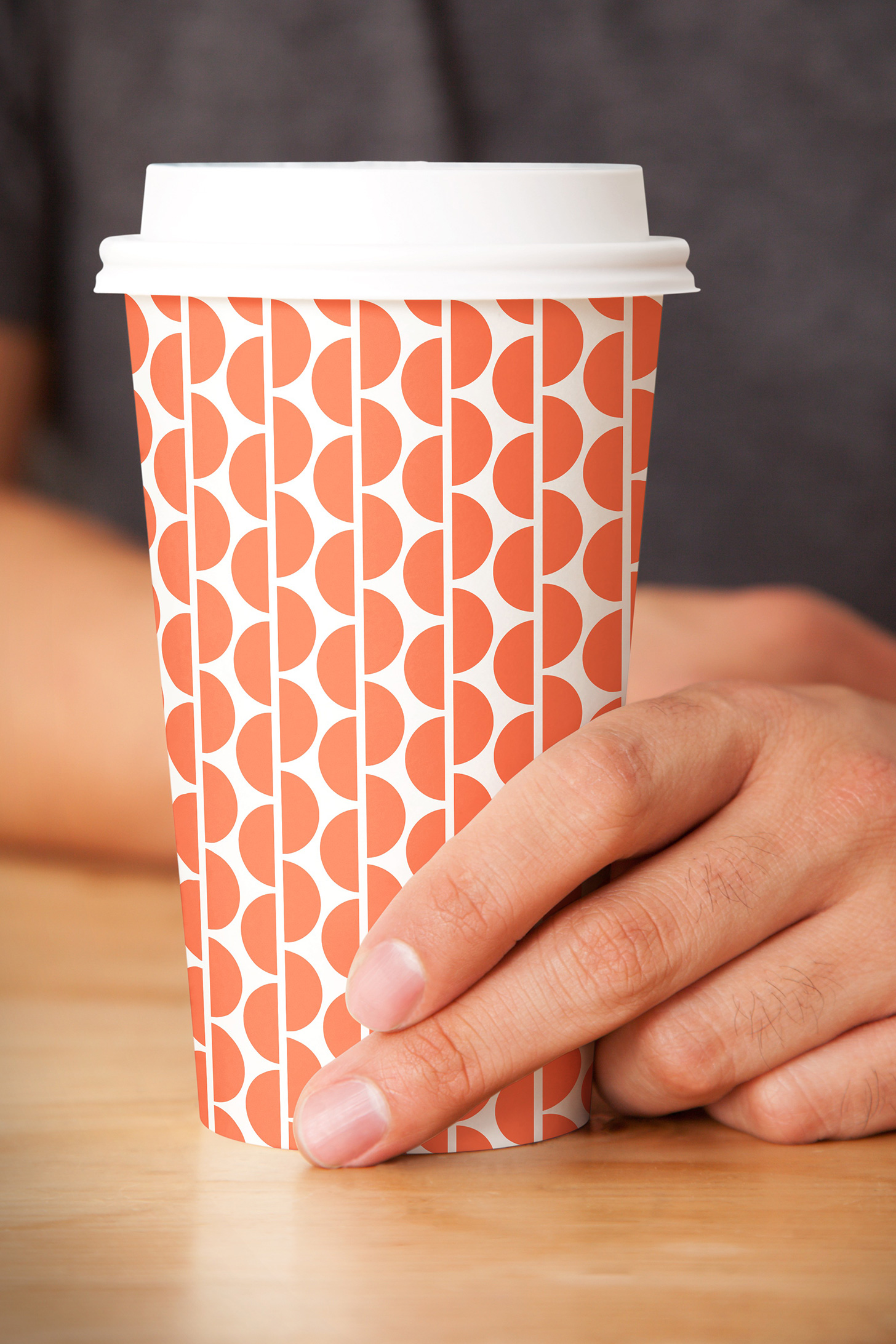
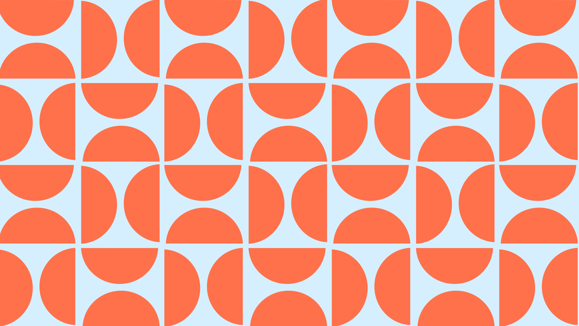
The logo serves as the foundation of the identity system and is incorporated into multiple patterns that bring a lighthearted playfulness to the brand. The patterns can be used with various colors depending on the target audience and messaging.

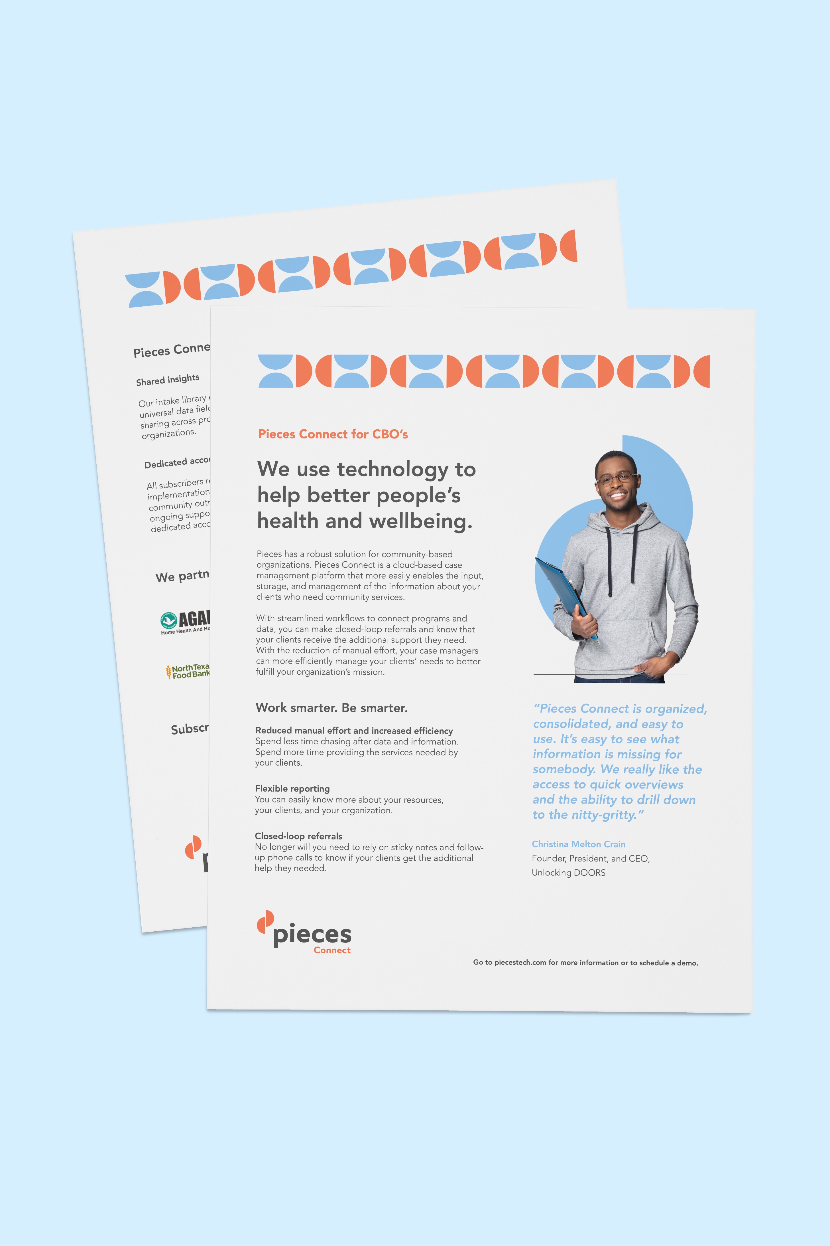
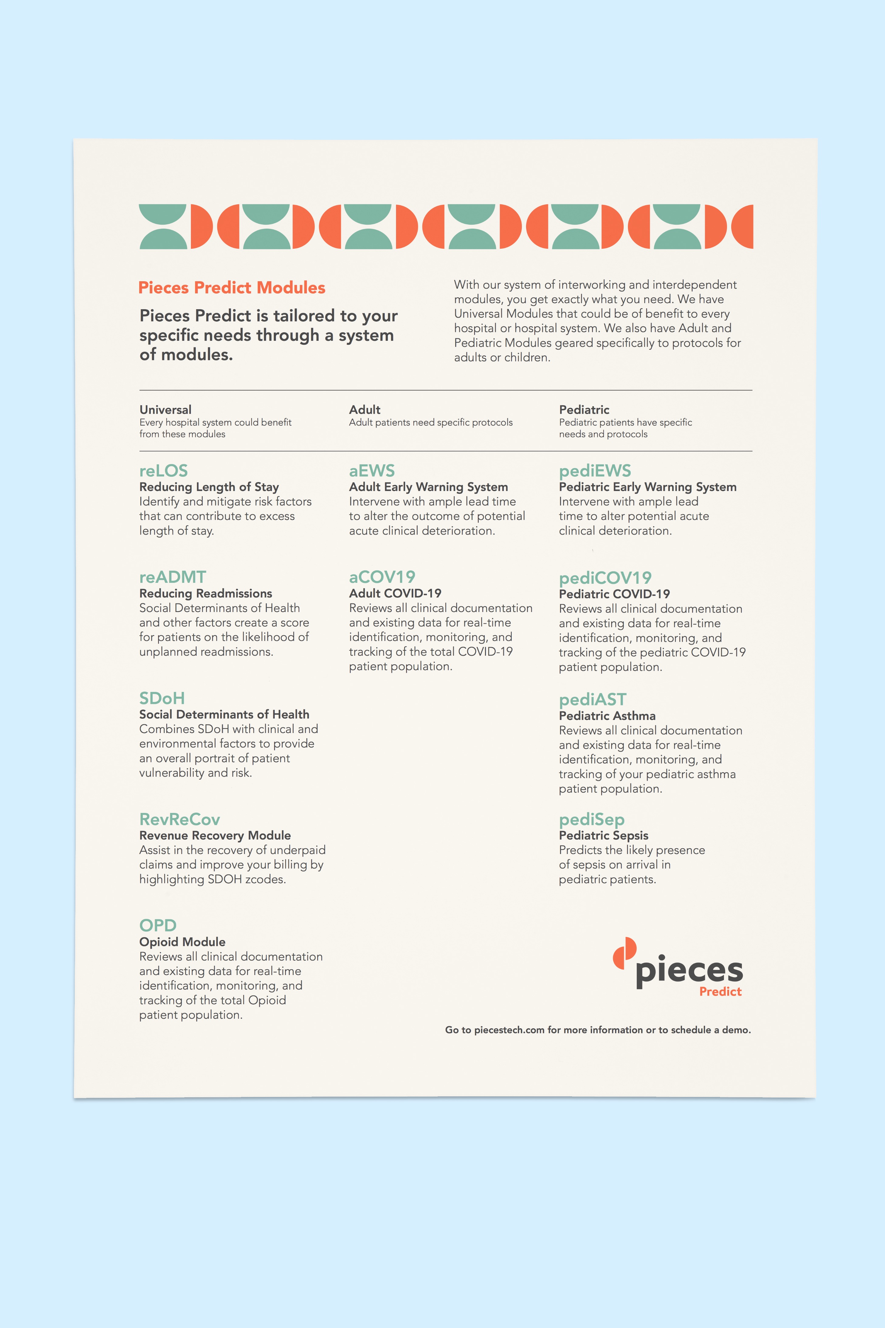
The color palette works as a system to bring clarity to the Pieces products and messaging. Pieces Coral is the master brand color and is present in all brand materials. Healthcare green is associated with Pieces Predict and is used in all health system, hospital and clinician focused messaging. Community Blue is associated with Pieces Connect and Pieces Guide and is used in all community organization focused messaging.


The goal of the product video snippet above is to visually show how Pieces Predict and Pieces Connect work together as a holistic solution. It is used on the product overview page on their new website.

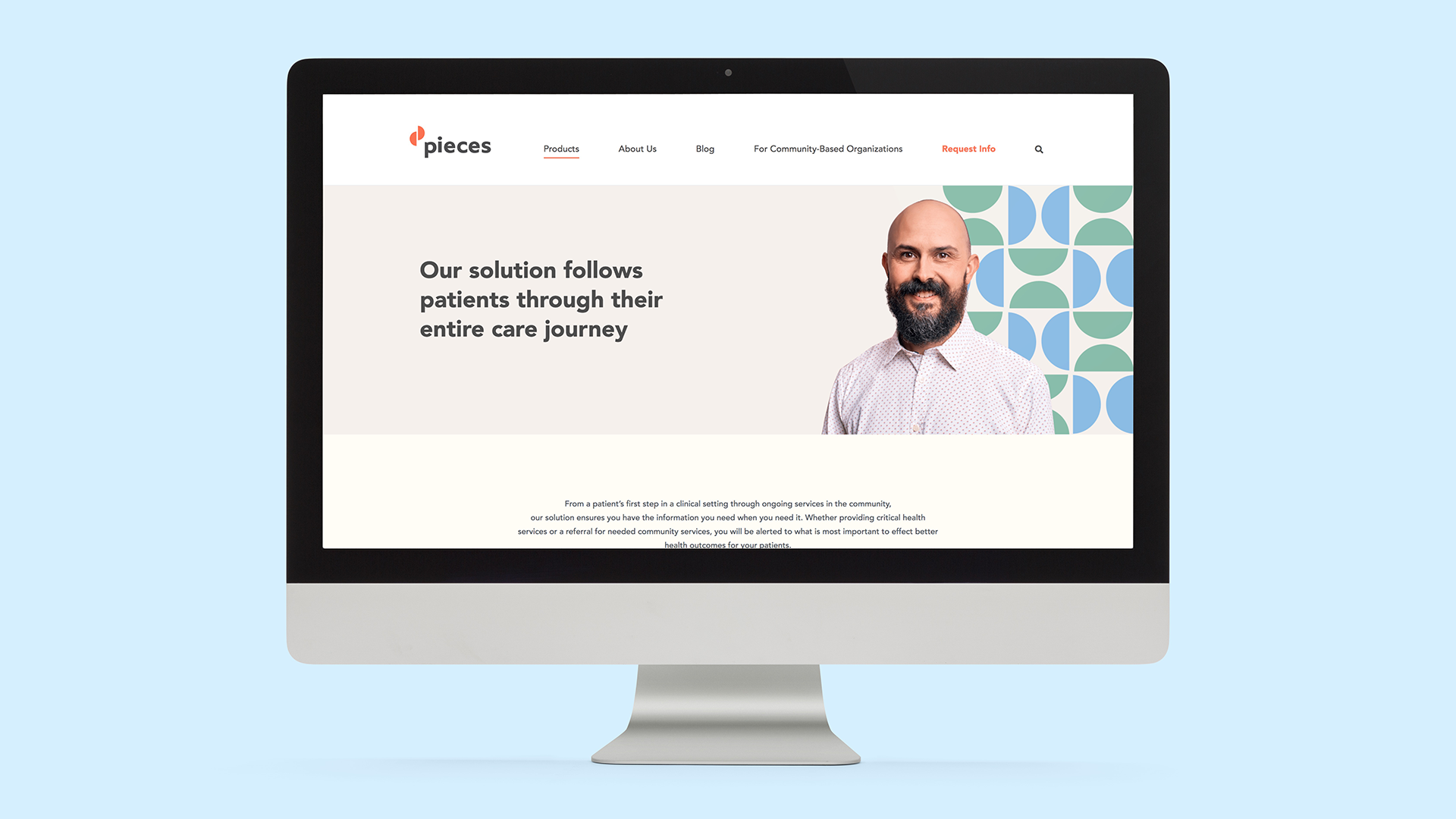
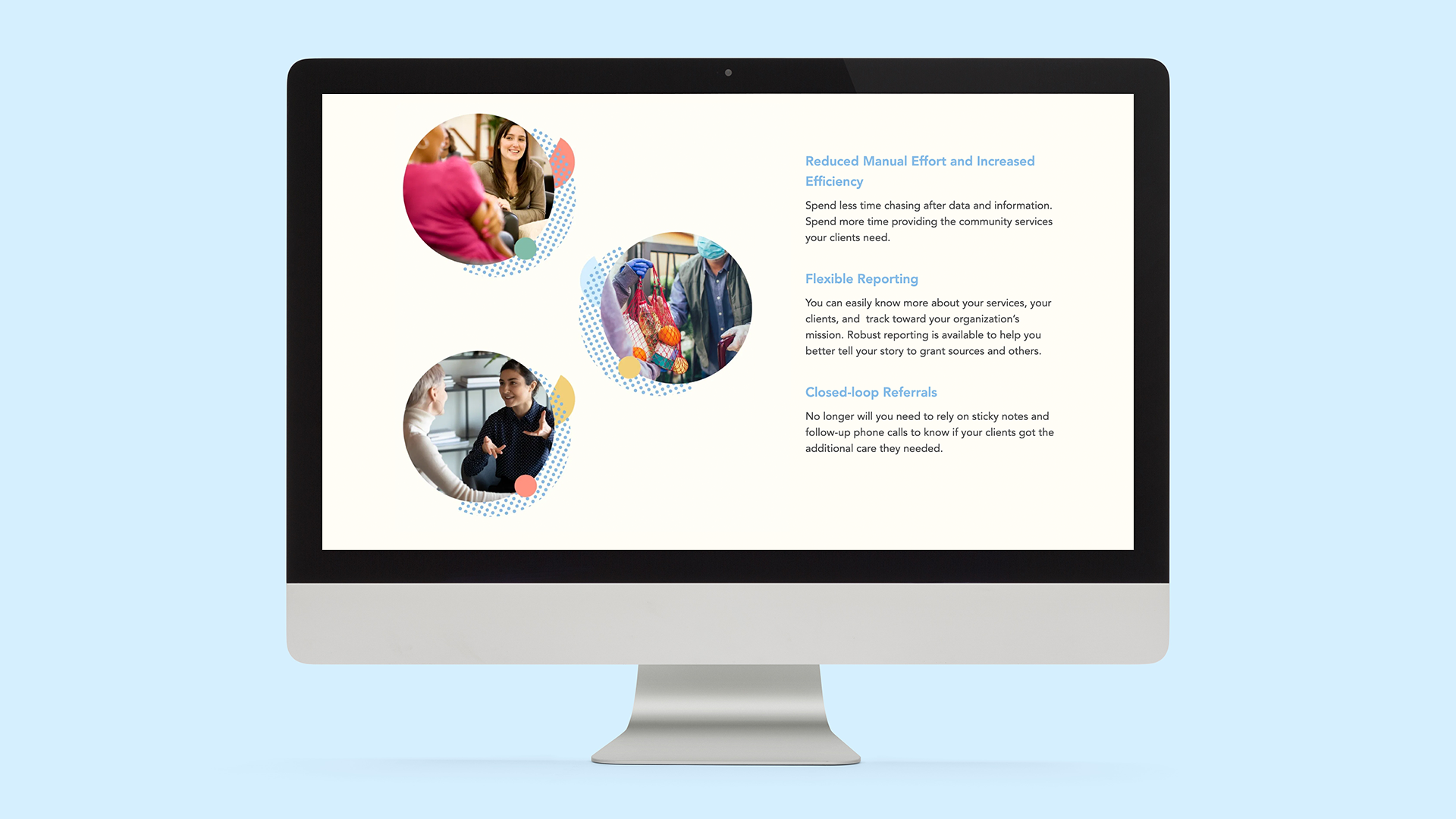
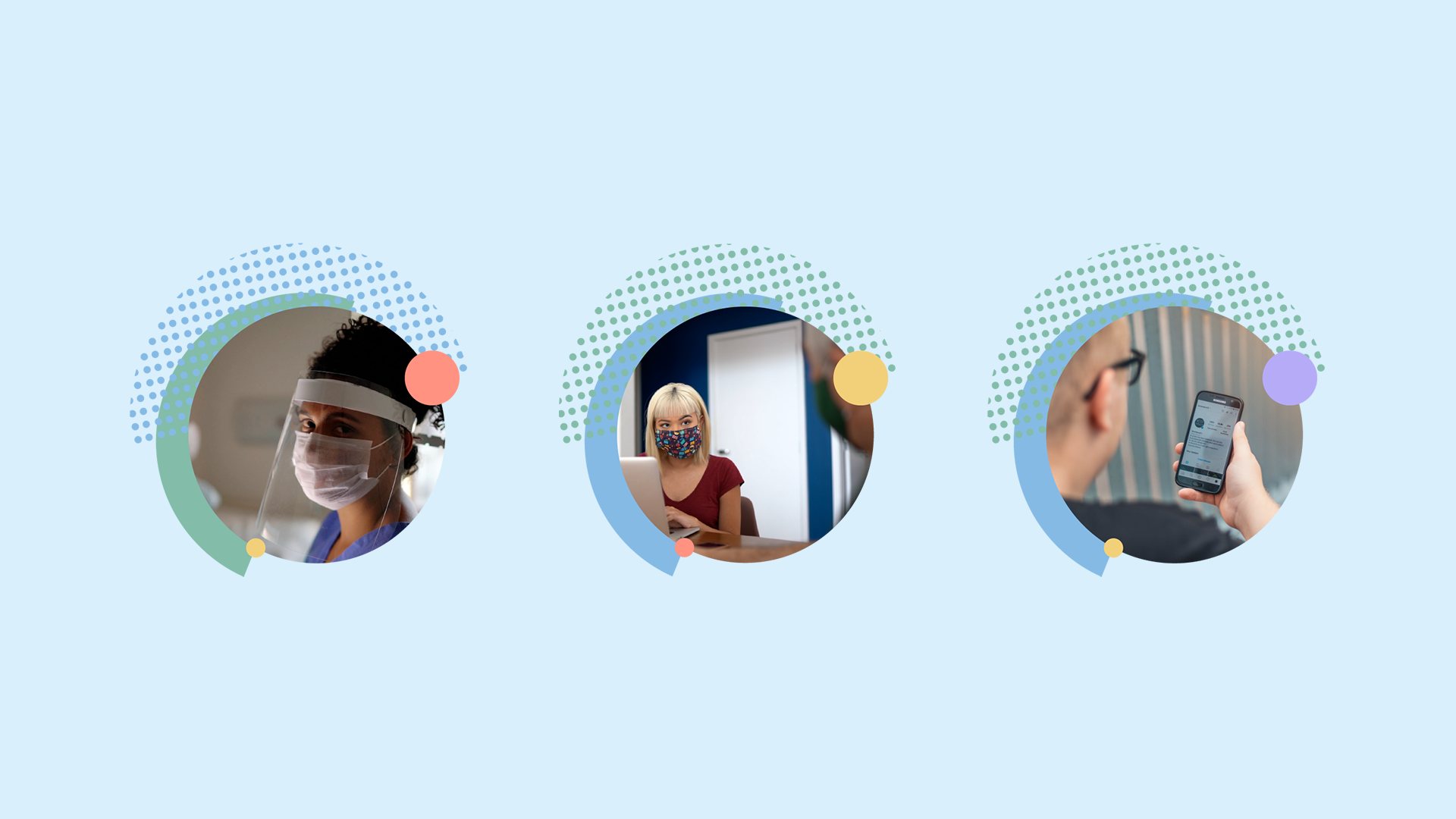
Every healthcare journey looks different. This idea is brought to life in the Pieces photography treatment by layering contrasting shapes together to create interesting and unexpected compostions.

A full icon library was designed to help visually support the many product offerings across the Pieces product lineup. They are used extensively throughout the website and branded materials.